Sunday 20 December 2009

Saturday 19 December 2009

My Photographs 2

This photograph is of cocaine as it looks like a very crystallized drug. The lighting hits the top of the background, which highlights the drug making it the main focus of the picture. I also contrasted and saturated this picture to make it more effective and professional to be put onto my website.


This photograph is of a variety of pills. They stand out on the dark background as they are brightly coloured, however, the actual lighting of the picture is dark giving the effect that pills are bad and mostly can not be trusted as they are usually cut with other cheap drugs.

Friday 18 December 2009

My Photographs

I used this photograph because this is how a crack cocaine addict would feed their addiction. The effect of the lighting is; the lights shining above him making him look angelic, which contrasts with the shadow caused by his head, drawing the attention onto the crack and the lighter to show the audience that this is the main focus of the picture. It also makes him look venerable to show the audience how addictive crack is, and to show them that anyone can get addicted to it.


Add ImageThis photograph shows the things needed to smoke marijuana with a joint laying on top of them, showing the audience what the focus of the picture is. The background is dark making all of the objects stand out. I have contrasted and saturated my pictures to make the quality of them look professional and suitable to be put onto a website.

Thursday 17 December 2009

Wednesday 16 December 2009

Young and Rubicam Quiz


I think this questionaire is reliable because it reflects my personality and my plans for the future. There is a lot of truth within this evaluation as it says my most important value is status, which is true because in the future i want to earn a large amount of money with the ability to buy luxuries and live in a comfortable environment.

Tuesday 6 October 2009

Improved Brief

Evaluation for AS websites
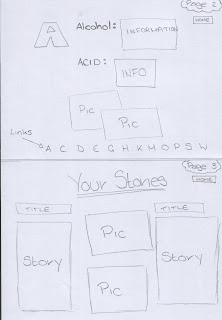
From my research I have found different types of conventions such as; the name of the charity at the top of the page, an image of what they are focusing at, audio, videos, and links to pages listed somewhere on the page. Other conventions are the main colours of the website and the written language as it makes it appeal to the audience they are focusing at. On my website I have used some of these conventions such as, the name of my website is at the top of the page with a picture of my main focus next to it. The background is green as my main focus is towards cannabis, with blue writing which makes the text stand out against the background. I have also used a video and audio on my website to attract my audience as it makes the website more active and appealing. The video is in the centre of the page with the links underneath it and the charities contact information on top just under the charities name. My websites also contains an A-Z of the most popular drugs and some of the effects which may occur after doing them which would appeal to my audience because its quick and easy to read but will tell you the main effects. My third page is somewhere where my audience can tell their own stories so other people can see how drugs affect families and the user. This may help people to actually realise how much they are affecting their lives and will hopefully encourage them to share their stories and to overcome their addiction.
My website is different from other drug charity websites because it is mainly focused at people who are addicted to cannabis. Also, my website has its own original layout with a video on the main page to draw my audience’s attention. The links are at the bottom of the main image going across the page, whereas the other websites have the links down the side of the page. Comparisons between my website and others I have seen on the web are; my website contains the same type of information and pages for example, there are pages where you can write about your own personal stories and read others. Another comparison is I have the name of the charity as a header with an image of its main focus somewhere near it on the page which is a convention most websites have.
The construction of my site will attract a young audience between the ages of 16 – late 20’s because they are the people who are most likely to experience smoking cannabis or taking others drugs. My survey also proves that mainly people between this age group have more experience with drugs as it is easy to access and people of this age usually take drugs socially. My websites layout will also attract my audience because it’s simple, colourful and the pages have the information spread out clearly. The written language on my site also appears to a young audience because it is brief but it contains the information they want to know. The background on my website is pale so that it is calm and so my text and images stand out on the page.
The design of my website will also attract my audience because it is plain but interesting, with videos, rollovers, images and a reasonable font size and text. The positioning of images and text on my website are clear and simple, so the audience can allocate around the website easily, with the information they need clearly on the page.

Monday 5 October 2009

Sunday 4 October 2009

Saturday 3 October 2009

Friday 2 October 2009

Thursday 1 October 2009

Wednesday 30 September 2009

Review

Media Assessment

As I have already completed a GCSE in Media, I had a rough idea of what to expect but I did not realize how big the jump was from GCSE to AS. I thought there would be a larger amount of work and slightly more complex projects to complete, however, my perceptions have changed as I have noticed a similarity between GCSE and AS with the project of producing a website. I think my written work has gone well because as I have experienced 3 years of Media already, I know what I need to write in my assessments and what the examiners would like to see. At the moment I have a good understanding of everything we have gone through, for example, TV Drama, analyzing websites and how to put my work onto blogger to keep it safe and accessible for the examiners to read.

The ‘Casino Royale’ DVD has shown me how films use sounds effects to cause tension, emotion and impact in their film and how important sound is to create the film. I did not particularly understand ‘Gone Fishing’ as I have only seen it once, and I did not find it interesting, however, if I saw it again I think I would appreciate it more and have a clearer understanding.